Welcome back, restrooms on the left, emotional baggage claim on the right! Last time around, I was ruminating about the things that have begun, over time, to bother me about the work of superstar comic artist/painter Alex Ross. Feel free to pop out and check part 1. I’ll wait…
Okay, you back? Are you sitting comfortably? Right!
The most problematic aspect that I discover with Mr. Ross’s (admittedly pretty) art: he draws from real-world models TOO faithfully. Check out this picture of Barry Allen.
Looks remarkably like my Uncle Jerry on his way to a costume party. The overall costume is shiny spandex, the cowl puffs up in the middle (as though badly darted), and The Fastest Man Alive looks pudgy where his chin and cowl bunch up. It looks chintzy, it looks tacky, and quite frankly, it looks like Alex painted a self-portrait wearing his Comicon costume. (And hey, if you dressed as Flash at Comicon, more power to ya! I gotcher back! Please don’t hit me.)
Now, look here: Flash?
First off, I am aware that this is Wally West, Flash III, rather than Barry Allen, Flash II. The costumes have minimal differences. But look how VITAL, how SLEEK, how much this picture conveys the MOTION aspect of The Vizier of Velocity… This is a Flash in action, unlike the pudgy, shiny, flabby Ross version.
In his excellent volume, “Understanding Comics,” Scott McCloud explains why the shorthand language of American comics has evolved the way it has: “By stripping down an image to it’s central meaning,” says Scott, “[an artist] can amplify that meaning in a way that realistic art can’t.”
Alan Davis’ drawing takes liberties with perspective, with time and dimension, with anatomy and musculature, using the pre-existing language of comics (i.e. speed-lines) to make The Flash look… well… Flashy. The Ross painting, again, comes off as a still life, under harsh lights, and suffers by the comparison.
Another example: The recent cover of Wizard X:
Superman. Batman. Tubby. And Frozen.
Jim Lee, working alone on The Man of Steel:
The collaborative Ross/Lee Superman looks very much like a waxwork to me. His coloration and depth are wholly out of sync with the simplicity of the form beneath. To put it bluntly, they’ve put hubcaps on a tractor.
Lee’s Superman, as seen below, is more iconic, possibly more “cartoony”, bringing with it a sense of tone, of the themes that Jim Lee wants to show with his work.
Is it George Reeves? Is it Kirk Alyn? Chrisopher Reeve? Tom Welling? None of the above. It’s Superman, end of sentence. Because we aren’t wasting nano-seconds of recognitive time figuring out WHO he is, we accept that he is Superman. Who he is, has become clear… The question now is WHAT is Lee’s art (and Brian Azzarello’s story) going to SAY?
Definition time! Cognitive Dissonance: ‘A condition of conflict or anxiety resulting from inconsistency between one’s beliefs and one’s actions.’ In this case, expanded (and possibly abused) to envelope my inability to accept that Alex Ross’s version of a beloved character is THE version of a beloved character.
Case in point: Reed Nathaniel Richards.
The one and only Mr. Fantastic, leader of Marvel’s flagship characters, The Fantastic Four. In some ways, I find I know Reed better than I know my online friends and associates. Reed and I have history. I’ve been interacting with Reed (admittedly, via a one way communications channel) for probably 27 years. I KNOW Reed. Alex Ross chose this man as a model for Reed:
I’ll say it right now. I love Gilligan’s Island! I do… But to MY MIND, Russell Johnson is NOT Reed Richards. So, every single appearance by Reed in Alex’s art, DRAGS me out of the enjoyment of the story, and forces me to be aware of the artist and his self-centered prediliction for stunt casting.
Anthony Stark. Iron Man. Captain of Industry. Two-Fisted Drinker!
Alex’s pick?
A better choice, in my mind… But still, every time I see him, I am reminded of how he played a Nazi collaborator in the Rocketeer… How he’s James Bond… How he’s BLEEDIN’ IRISH!!!
The looser, more iconic form of, say, Jack Kirby’s Reed, or Bob Layton’s Tony, or even a quasi-photo-realistic interpretation like Matt Wagner’s Superman painting Seen Here.) give us a “blank slate” This allows EACH reader to bring a little piece of him or herself into the proceedings, to be an active participant in the book, in the experience of reading, rather than being dragged about, as if in a museum, being shown SOMEBODY ELSE’S idea of art.
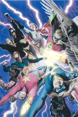
Scott McCloud (him again?) opines that this precise theory is what makes children so receptive to cartoons. The simplicity of the drawing, the need to use YOUR imagination, makes the consumer a PART of the creative process. You fill in the gaps, in a way, BECOMING the character. A photo-realistic Star Spangled Kid makes me nervous, for her safety, for her parents, for my own ability to look at a 17 year old in skin tight costume without going to special counseling.
Simply put: When you look at a photo of a face, says McCloud, you see the face of another. When you look at an iconic/stylized/cartoonish face, you fill in the blanks, designing, participating; in essence, BECOMING the character.
Alex Ross’s artistic choices force the reader to draw himself or herself out of the story, to give up a bit of enjoyment by making them AWARE of their suspension of disbelief. Mr. Ross can be, in my opinion, a selfish creator, FORCING the consumer to accept HIS vision, rather than allowing his fanbase to participate and interpret the work through their own ends. Photo-realism, in this case, undermines part of the joy of comics, the vicarious thrill. A stylized, more abstracted work, like the Lee Superman above, doesn’t force a perspective on the reader, instead, it allows the reader to draw out of the story what he/she wants, and heightens the enjoyment of the overall process.