As a long-time comic book reader, I have come to realize that it (like most entertainment channels, really) is a cyclical game. In recent years, I have heard people refer to the new Renaissance in comics, with talented writers on long-since-thought-wrung-out characters… Moments like Actor/Director Kevin Smith taking over a written off character called Green Arrow. Moments like Scottish writer Mark Millar’s stunning “Wanted” series, apparently starring Eminem. Moments like writer Brian Michael Bendis single-handedly redefining the Avengers.
Inevitably, I think back to the LAST time I heard such high praise, such high hopes, such smoke blown up so very many collective glutei.
It was the early 1990’s, and comics were in a low period. (Alright, smarty, I hear the peanut gallery crying out “They can get lower?” Pipe down, you!) I clearly remember when a series called Marvels came out… Spider Man, The Hulk, The Avengers, The X-Men, all seen from the perspective of the proverbial “Man on The Street” with photorealistic painted art.
At a time with Marvel Comics (home of Spider-Man, The X-Men, The Hulk, and other future movie properties) was churning out utter drek at a staggering pace, Marvels was deftly written, with characters that long-time fans recognized, behaving in a manner that even the new “grim and gritty” crowd caught on to. I was absolutely BLOWN AWAY by the work, fully painted art, by a new kid named Alex Ross. I had seen his work on Terminator comics, but wasn’t really a fan (of the art OR the comics).
But his painting, combined with the masterful scripting of Kurt Busiek, really brought a whole new perspective to comics, and brought back to life concepts that Marvel was allowing to languish. The building blocks, if you will, of the Marvel Universe had been misused, abused, and otherwise mutilated, but Ross and Busiek were showing that they weren’t irrevocably gone. The showed what COULD be done. It may not have been Marvel’s “Citizen Kane,” but it was a good solid “Magnificent Ambersons.”
Busiek and Ross just… GOT IT. Observe:
Marvels #1
Marvels #3
Marvels #4
Looking back, now, I find myself troubled by the art. It’s not that the work ages particularly badly. It’s not really any more or less oxidized than anything else that came out during that, the Gilt Age of Comics. But as I view and re-view the art, I remember what I initially drew me to it: Dynamic perspective. Photo-realism. Light and shadow. Recognizable characters…
And yet… I like it, less and less, each time I see it. What once seemed fresh and new, now comes across as… forced. The Angel on the cover of issue #2, for instance…
Obviously references to classical paintings, ala the wing placement, the noble curve of the chin, the soft lighting on the wing. Very Caravaggio. And yet, it’s lifeless. There’s no character, no life, no VERVE. It’s a very pretty snapshot of an ugly scene.
Alex is currently doing covers for one of my favorite comics of all time, a title called JSA. And each issue, I look at the covers, and I appreciate the craft behind the work… To be frank, I’m kind of jealous of the talent involved. But when I open the book, I find I can’t quite accept the covers at face value anymore…
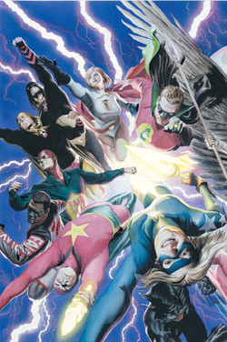
Wanna know why? See the girl in the right foreground? That’s Courtney Ross, the former Star Spangled Kid, now Stargirl… She’s approximately 17 years old, a teenager with braces, who is learning the ways of the superhero world from the veterans of the Justice Society.
That is how the original artist portrayed Star Spangled Kid, and how I see her. A spunky kid, full of attitude and sass, ready to wedge her Doc Marten in the pudgy ass of evil. A superhero who isn’t less cool because of her blonde ponytail and XX chromosome. Look again at the JSA cover. What do you see?
I see a kid. A real flesh and blood girl, whom I don’t want to see impaled on the Sword of Anubis, or punched by Black Adam, or god forbid, sliced open by a Joker-branded deathtrap. SHE’S TOO REAL!
The use of this unneccesarily more realistic image has actually distanced me from the story I enjoy, and from the comic that I usually love to death. It’s no longer Stargirl, kick ass hero. To my mind, it’s Courtney, the young girl who babysits down the street. Not someone I want to see in mortal danger.
And it’s more than just offending my macho BS sensibilities… The picture of the Stars and Stripes cover is ACTIVE, it’s DYNAMIC, it’s SSK about to kick you inna face! The Ross cover? It’s a still life. Beautiful, but essentially dead. It looks carved, forced… The characters look frozen, locked in a painstakingly drawn, but still mostly boring skyscape.
Even setting aside how successful or unsuccessful the work is, it’s a very selfish, very self-aware, and a very one-sided communication model… More on THAT next time! Same Cobra time, same Cobra station!
One reply on “Hyper-Realism and Cognitive Dissonance – OR: Why Alex Ross Must Be Stopped!”
wow! great analysis, wonderful writing and a very interesting article!!